Report
Using Tableau, create visualization for each question in the report regarding bird strikes.
Authors
This report is prepared by
(How many flights have been cancelled by birdstrikes?)
This question was asked by pail4944
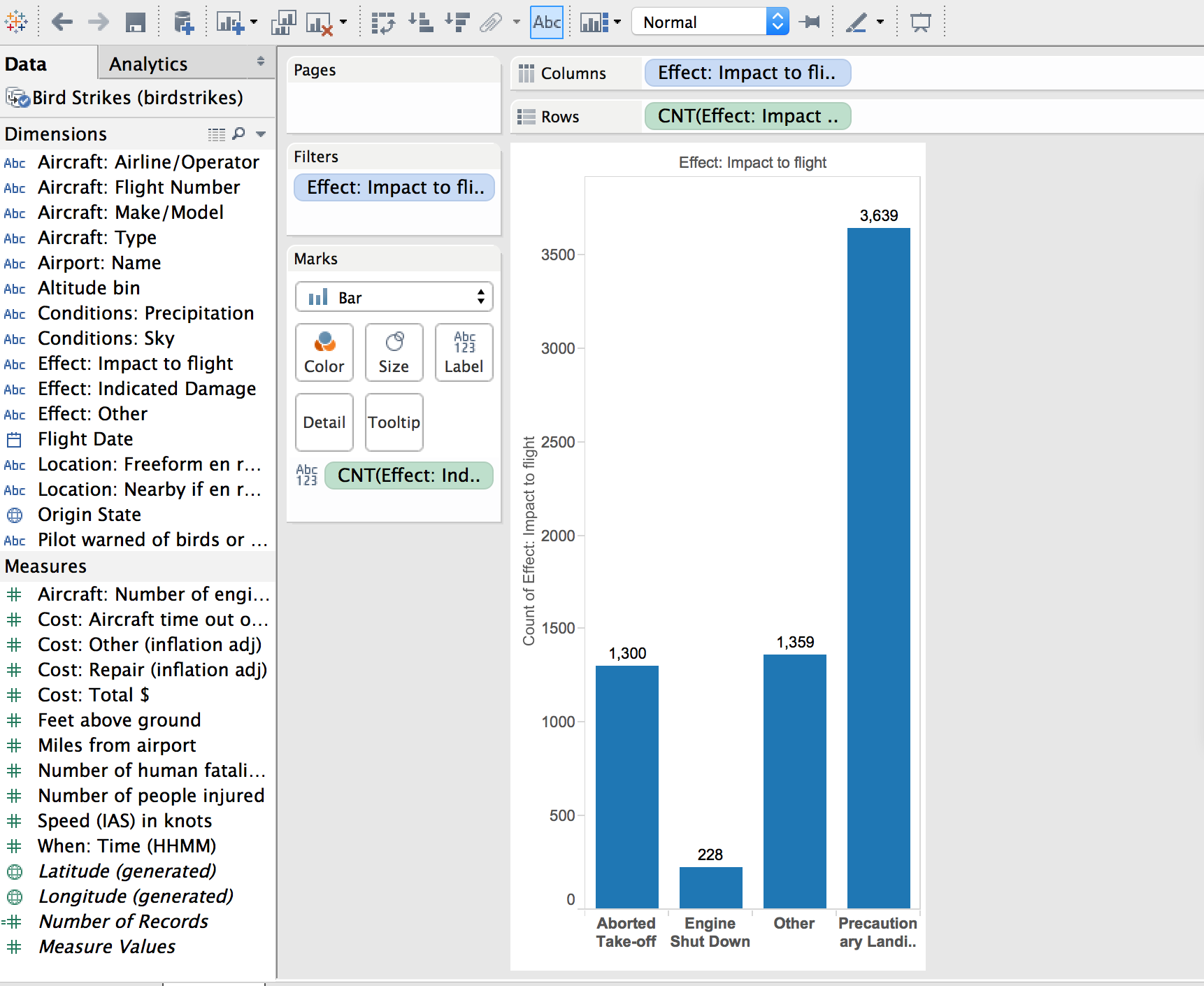
The graph indicates the number of occurrences and the type of cancellation that occured.
(What are the top 5 bird species?)
This question was asked by ZachLamb
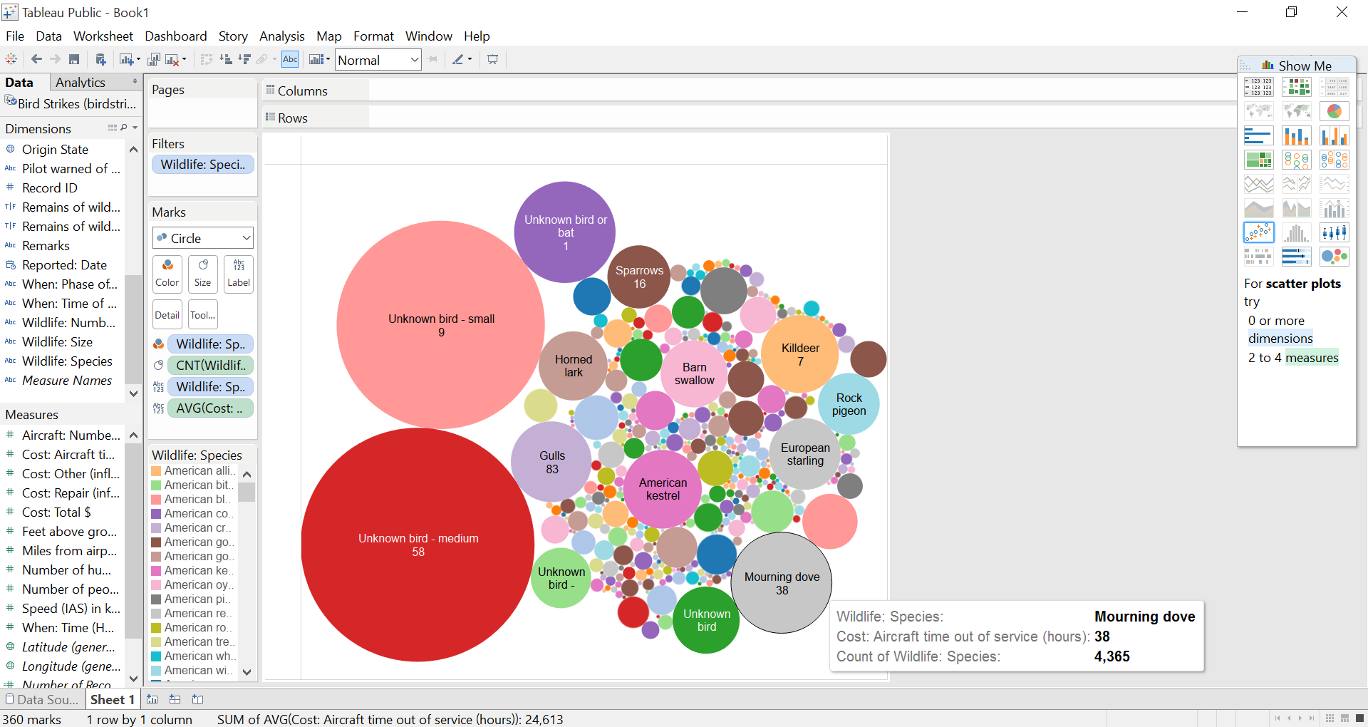
The largest bubbles indicate the greatest number of occurences of a particular species in the birdstrike. The number below each species indicates the average cost in hours incurred by said species.
(What states cost the airlines the most money? (Cost and location))
This question was asked by (student's github id).
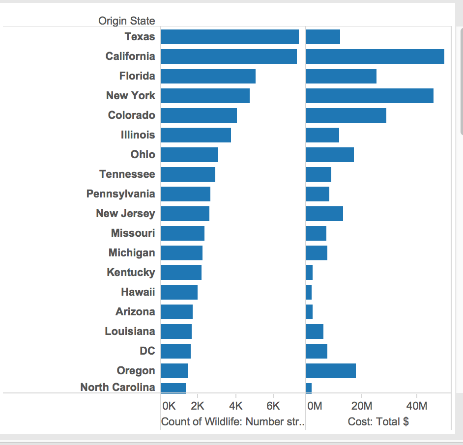
I graphed the number of bird strikes according to origin state, along with the sum of total costs of damage due to birdstrikes
What is the most common flight phase where a birdstrike occurred (KevinKGifford).
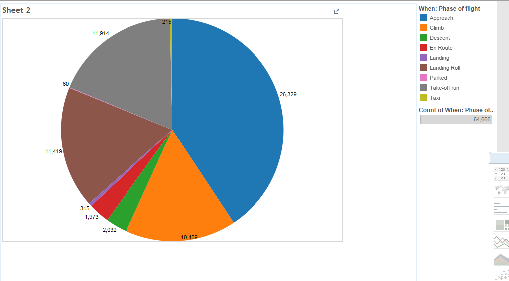
(This is a pie chart the represents what portion of the birdstrikes happened during each phase. The legend in on the right the most common was approach)
What type of aircraft has the most instances of damaged caused by bird strikes? (nicolele).
Answered by Zhili Yang
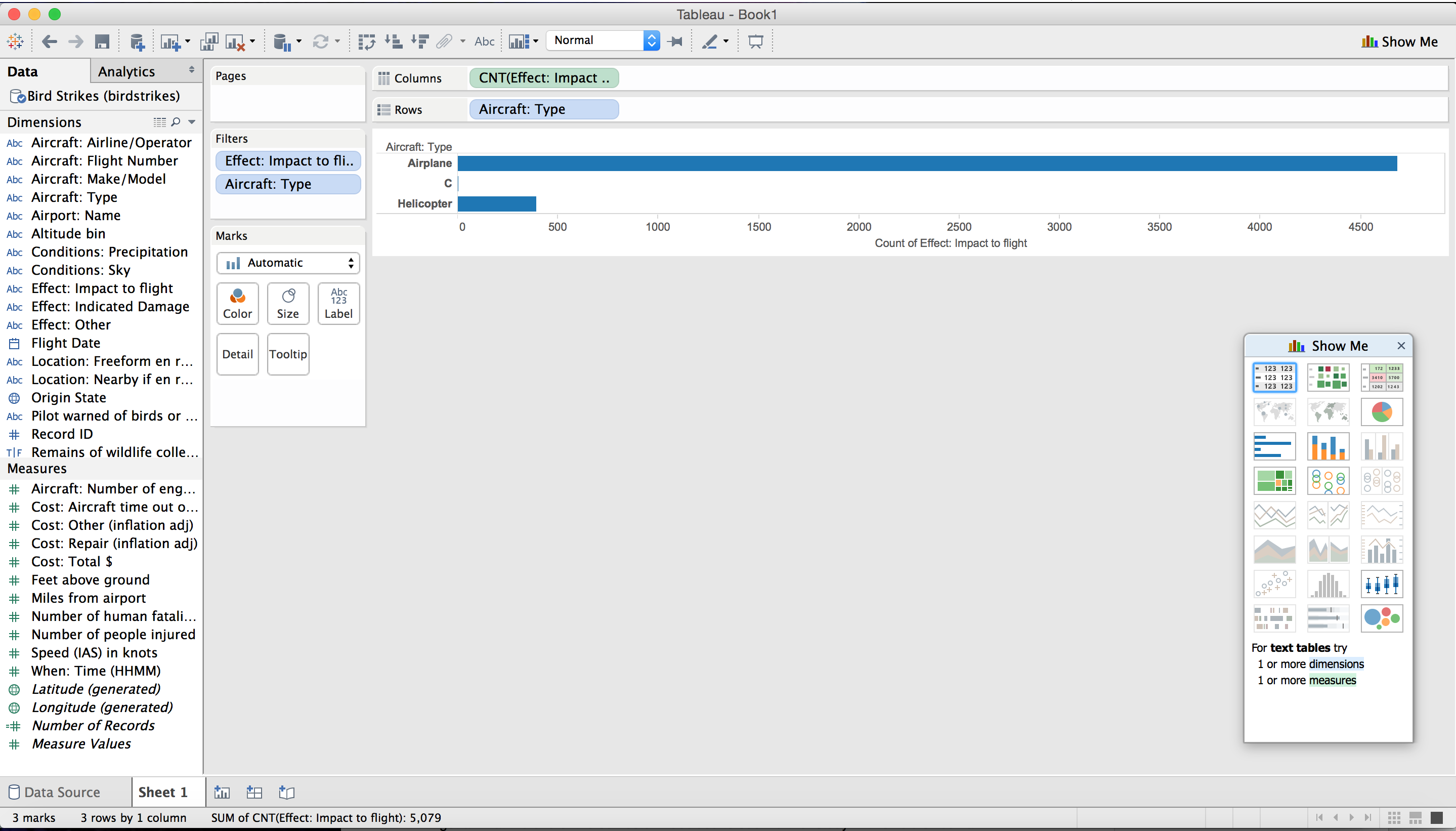 Airplane is the type with the most instances of damaged caused.